

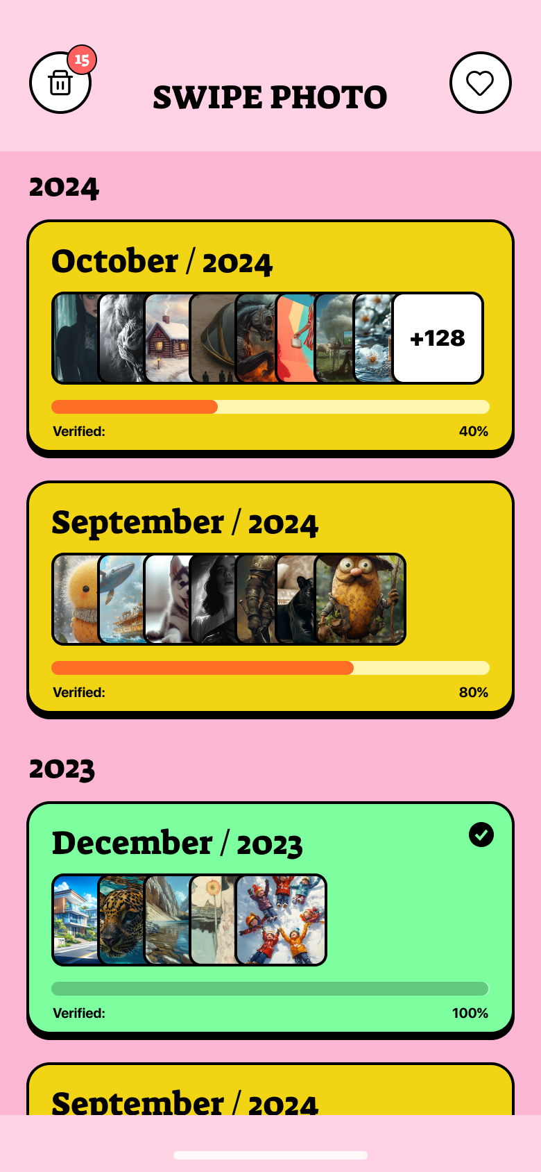
I designed SwipePhoto from scratch — concept, flows, UI and motion — around one bet: turn deleting photos, the most boring chore on your phone, into a game. This case shows that process end to end.
Turning the most boring chore on your phone into a game — interaction design, motion, and the psychology of a habit you'd actually build.
What I was designing for
The challenge
The average phone holds thousands of screenshots, blurry shots and near-identical duplicates. People feel the storage anxiety — but the actual job of deleting is slow, joyless, and a little scary. Existing cleaners made it worse: endless grids, “YOUR PHONE IS FULL!” fear screens, and upsells that felt like a scam.
The brief: build a cleaner people would open for fun, trust with their memories, and happily pay to keep using — on a tiny iOS team.
Discovery
It’s so boring and endless
Reviewing photos in a grid is decision fatigue at scale. People quit after a screenful and never come back.
What if I delete a good one?
Loss aversion freezes people. Without a safety net, they hoard everything “just in case.”
These apps feel scammy
Fear screens and aggressive paywalls killed trust. People wanted help, not a horror movie about their storage.
From a teardown of how mainstream photo-cleaner apps work, and the words people actually use in their public reviews — the frustration I designed against.
How I decided
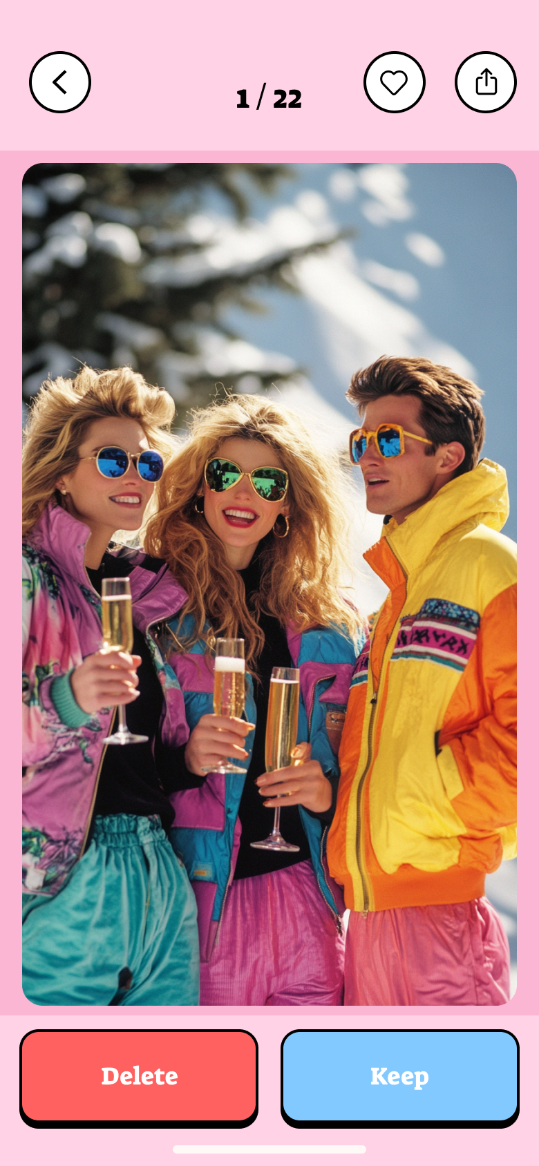
One photo, one decision, instant feedback. Momentum over grids.
Nothing is gone until you confirm. Undo and a trash buffer, always.
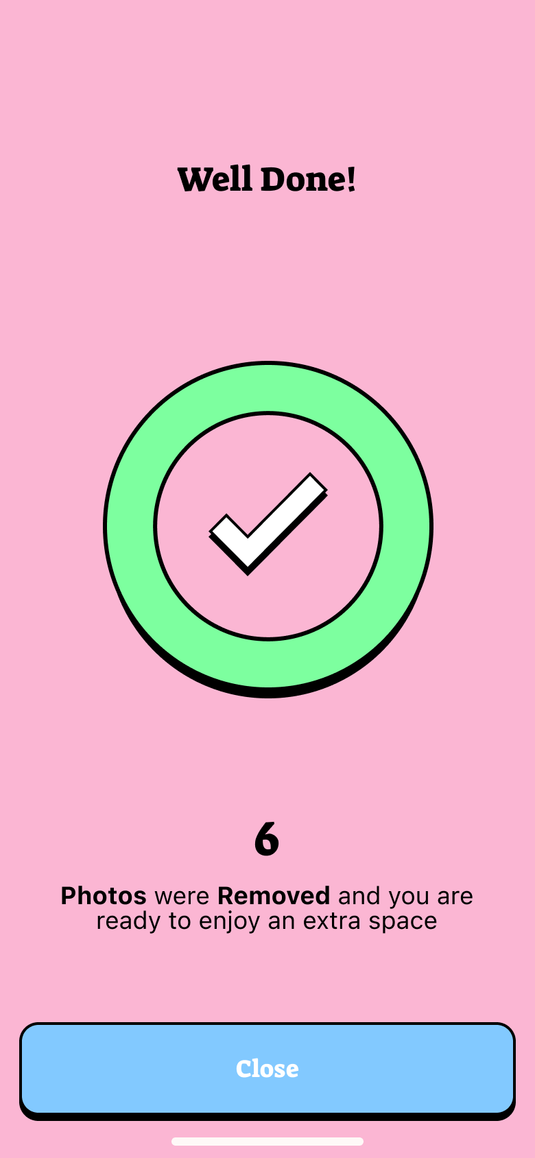
Celebrate freed space. No fear screens, no dark patterns.
Key decisions
I worked through the concept iteratively — starting with the obvious approach, stress-testing it against the research insights, and redesigning the moments that broke the experience. Every call below is mine, with the trade-off made explicit.
Delete

Keep
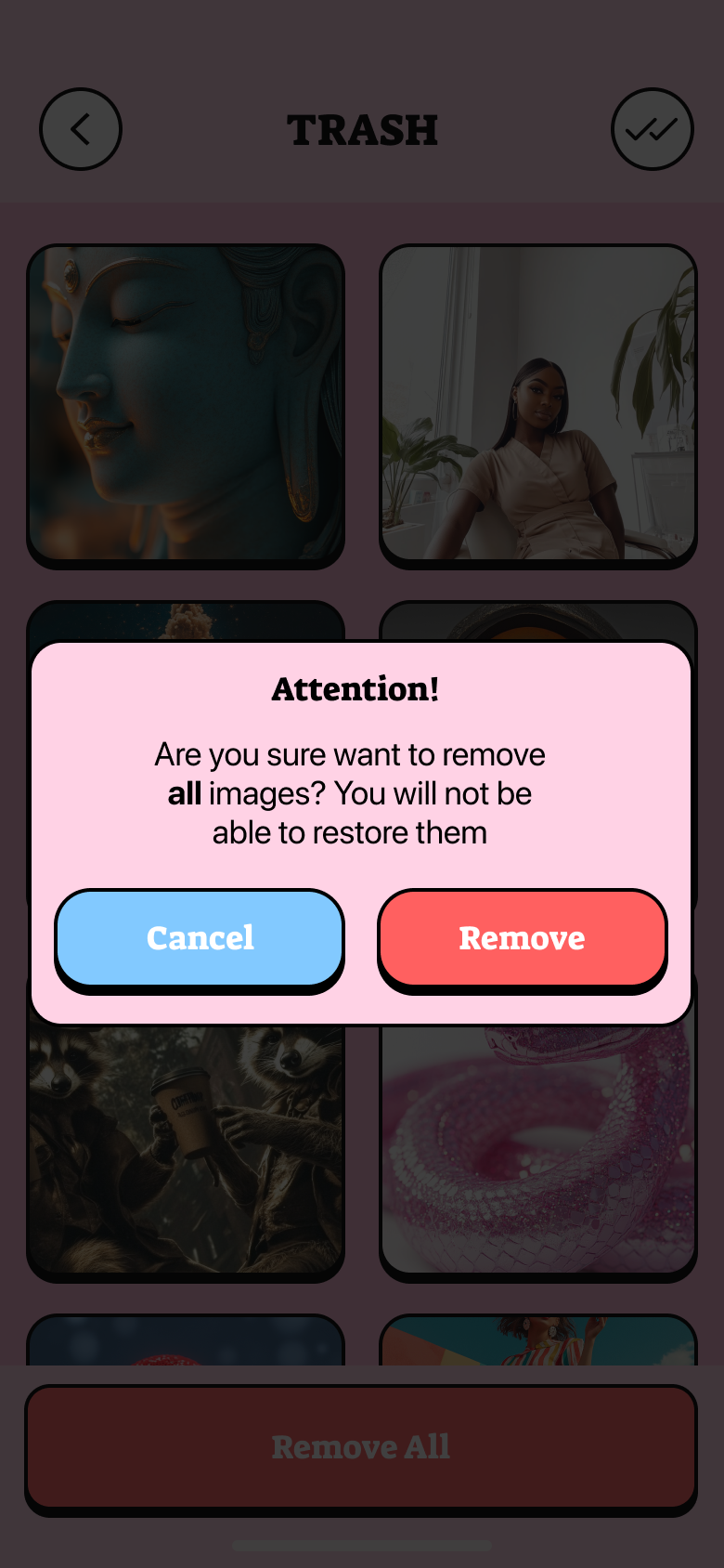
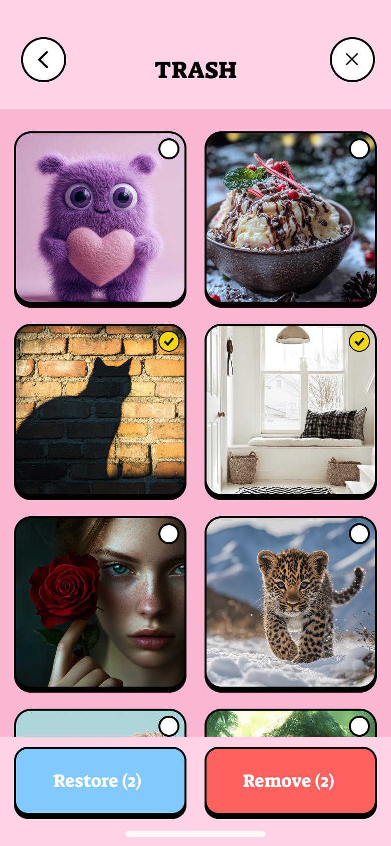
Trash
Review
Months
Duplicates
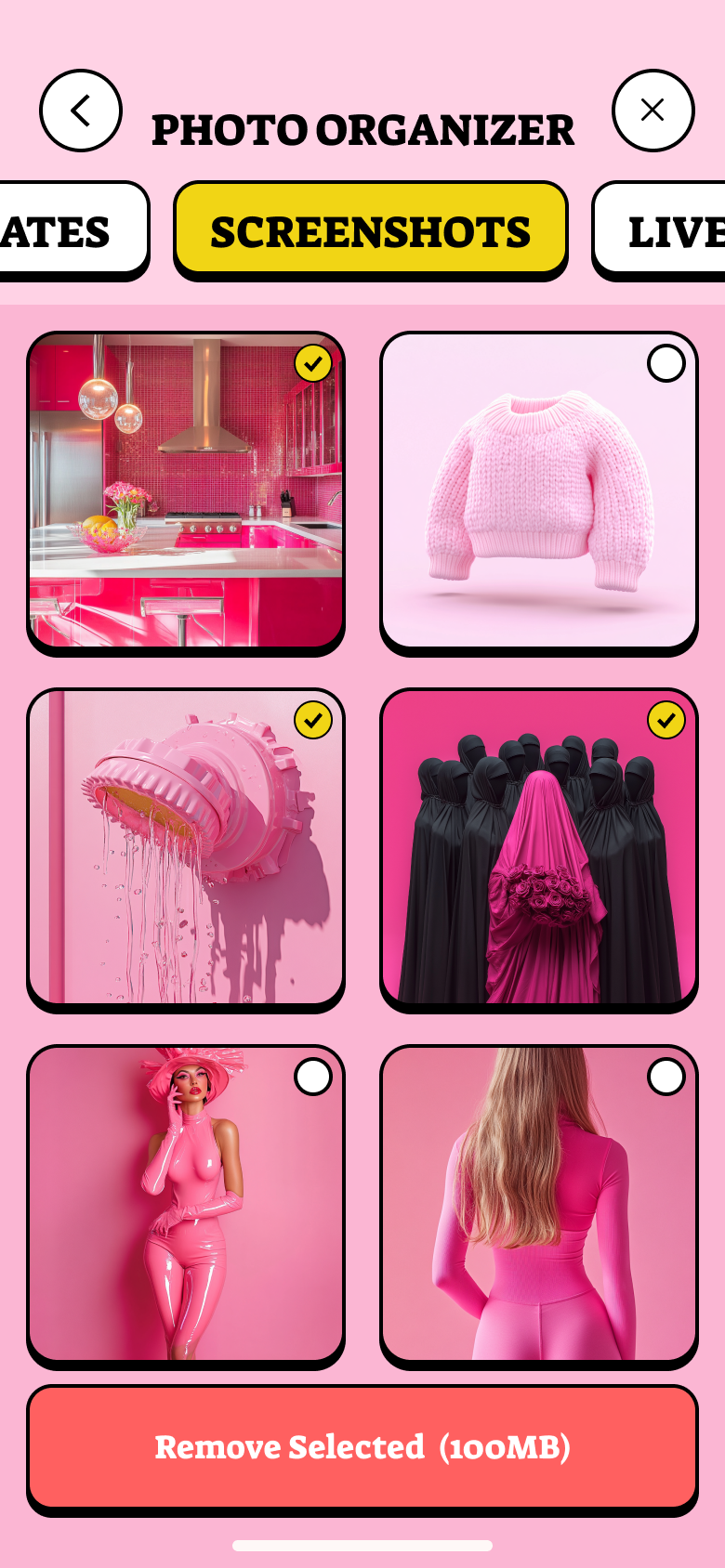
Screenshots

Scan
Reward

Favorites
Preview
Other cleaners sold fear. SwipePhoto sold the satisfying click of a tidy camera roll.
Proposal
One photo, one binary choice, instant visual feedback — the swipe mechanic removes the activation energy that makes grid cleaners feel like work. The mechanic is borrowed from a proven pattern (dating apps) and applied to a new domain where it solves a real UX problem.
Routing every swipe through a Trash buffer — rather than asking for confirmation before each action — is the difference between a safety net that feels like friction and one that feels invisible. Users need permission to be fast; the buffer grants it.
Splitting the roll into month piles and auto-detected clusters (duplicates, screenshots) gives cleanup a shape. Each pile has a start, a progress state, and an end — which is the minimum viable structure for a recurring habit.
Honest next step
Does the completable-chunk model hold past week one? I'd watch whether pile size (a dense October vs a sparse January) predicts drop-off — and tune pile-splitting logic if it does.
My design bet is that a reward-first paywall converts better long-term than a fear-based one. I'd A/B test both, with session-2 conversion and 30-day retention as the key signals — not first-session revenue.
Deleting a local copy that's synced to iCloud is a different action than deleting a photo that lives only on-device. Surfacing that distinction clearly — before the user swipes — is the trust gap I'd close in v2.
Reflection
First builds let people swipe faster than they could think. The trash buffer + a subtle “undo” toast fixed it — but I’d design the safety net before the speed next time.
A few users found swiping gimmicky for large libraries. I added a plain multi-select list mode — same engine, calmer surface.
Local vs cloud deletion confused power users. I punted real iCloud-state handling to v2 — in hindsight worth scoping up front.
Design system
Palette
Typography — Outfit display, Space Grotesk body
Key components
Red/blue action language users already understand.
A completable chunk with a progress bar.
Celebrate freed space — never a fear screen.