Back
SwipePhoto Observer Adblock Green VPN SoftShield VPN Fluid Chat AI Hypurr Wallet Yooca
Self-initiated concept · iOS

Fluid Chat AI

A self-initiated concept exploring the hardest UX problem in AI apps: what do you show when the chat is empty? I designed a multi-tool AI assistant — chat, image generation, summaries and prompt packs — built around the idea that nobody should have to stare at a blinking cursor.

Solo concept — UX, UI, motioniOSConcept · 2024

What this shows

AI-product UX: beating the blank-box problem — designing the empty state of an AI assistant so non-prompters create something on their very first try.
AI tools
Home
Chat
My role
Solo designer — research, UX, UI & design system
Type
Self-initiated concept
Year
Concept · 2024
Platform
iOS · AI assistant · freemium model

What I designed for

0→1
First-session creation
Beat the blank box — get any user to produce something on first open
6
AI tools surfaced on open
Chat, image gen, summaries, assistants, prompt packs, code — all discoverable immediately
0
Prompt skill required
Pre-built intents & assistants do the wording for you
0 gate
Value before paywall
Credits let users generate something real before the Pro ask

The challenge

Everyone shipped the same blank chat box

The market was flooded with ChatGPT clones: a cursor, an empty input, and a silent “…now what?” Powerful underneath, paralysing on top. Most people don’t arrive knowing the perfect prompt — they arrive with a vague need and bounce when faced with a blinking line.

My brief: turn raw AI power into something a first-timer can do something with in ten seconds — without ever staring at an empty box.

What it does

One app, many superpowers

💬

Smart Chat

Ask anything, in plain language.

🎨

Text-to-Image

Generate art from a description.

📄

Summaries

Web pages & PDFs, distilled.

🧠

AI Assistants

Specialised helpers for real tasks.

Prompt Packs

Rewrite, translate, and more.

⌨️

Code Helper

Write & explain code.

Discovery

Why people bounce off AI apps

I don’t know what to type

The blank box is a wall. Without a starting point, people open the app, stall, and close it.

What can this even do?

Capabilities were invisible. Users had no idea image gen, summaries or assistants existed.

Why would I pay?

Without feeling the value first, the paywall landed as a tax — not an upgrade.

From a teardown of how mainstream AI assistant apps handle the first session, and the recurring “I don’t know what to type” complaint in their public reviews — framed as the hypotheses a live product would test.

Key decisions

Every call is mine — and each one has a clear rationale

I traced the blank-box problem to its source, made three structural bets to solve it, and designed each in detail. These are the decisions I'd stand behind in any product critique.

Tool-first home
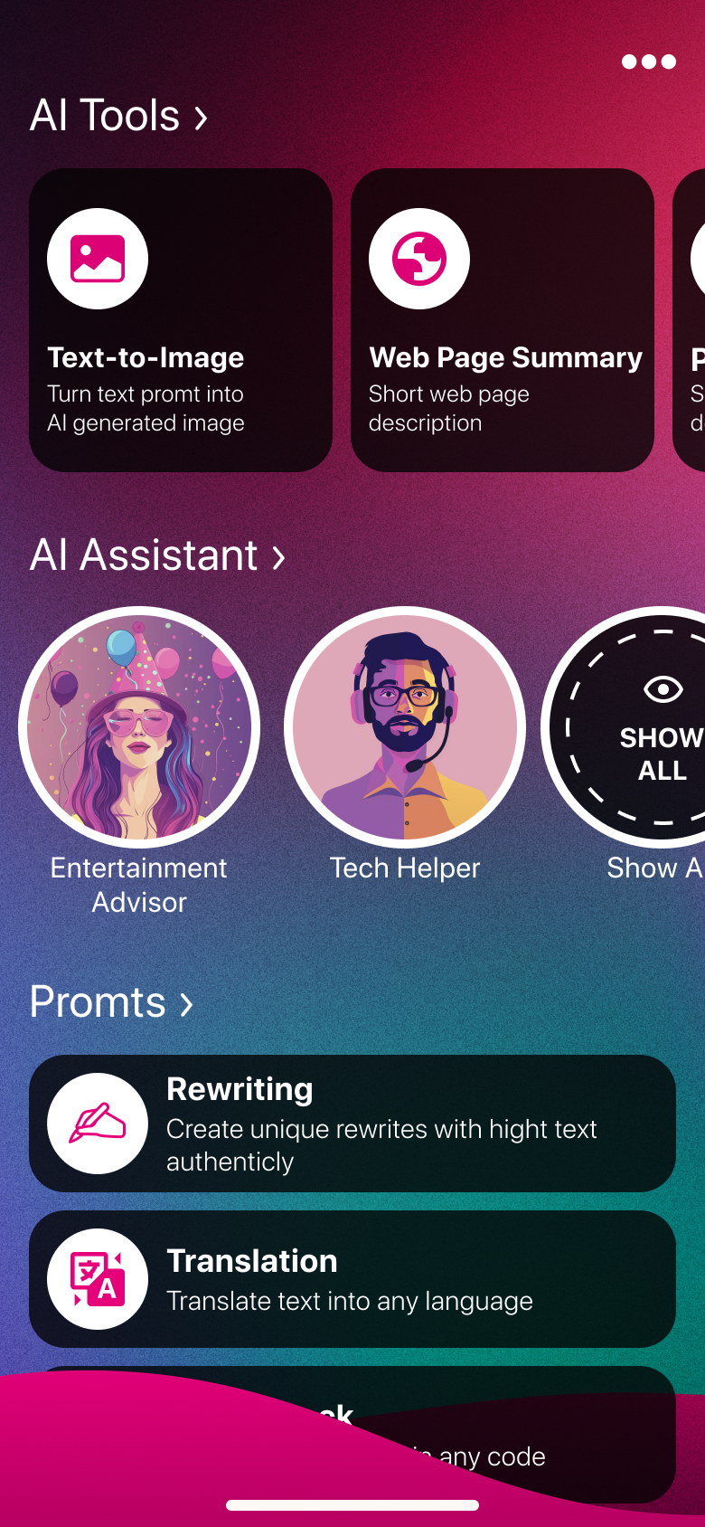
AI tools
01 Beating the blank box

A tool-first home, not a cursor

What I designed
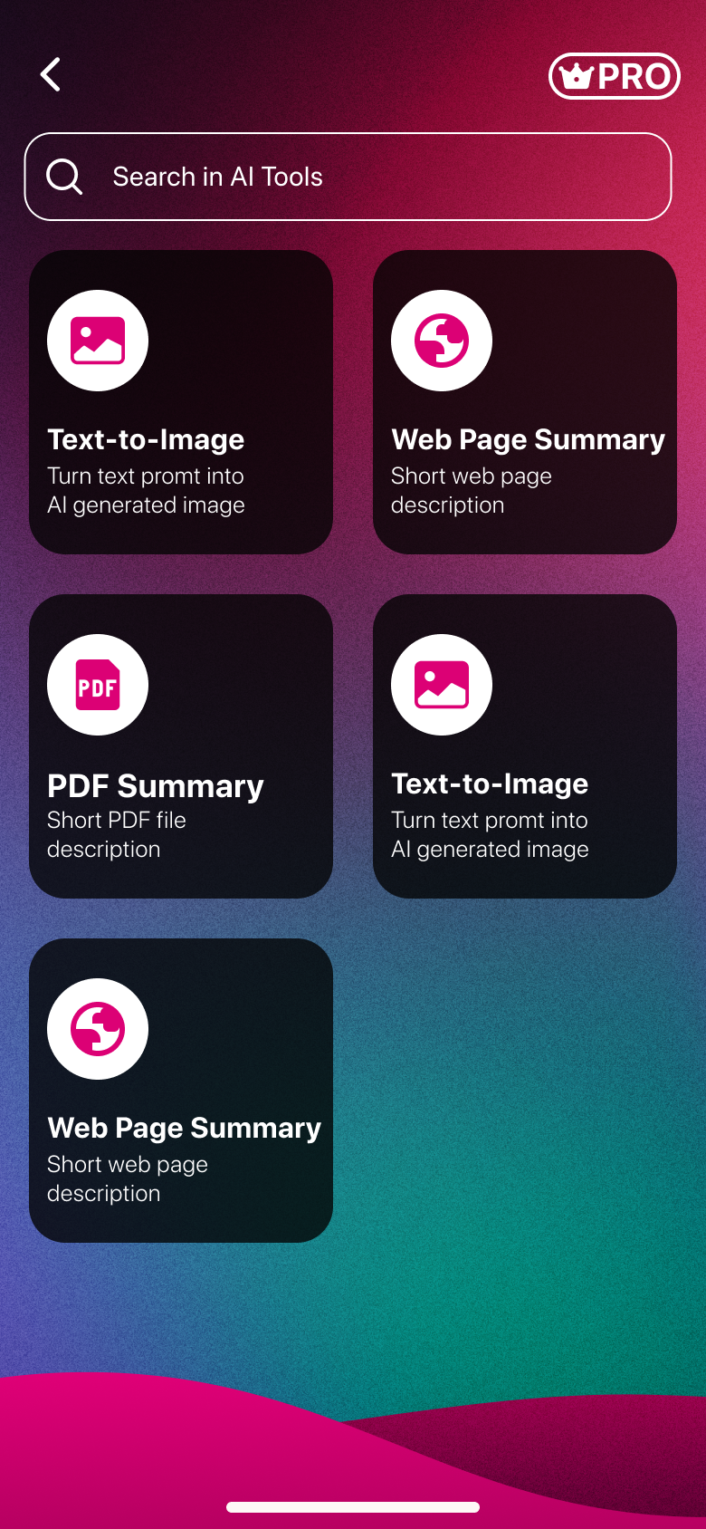
Instead of opening to an empty chat, I opened to choices — AI Tools, Assistants and Prompt packs as vivid gradient cards. Every tile is a ten-second starting point.
The problem it solves
Blank-chat AI apps leak new users — no starting point means no action. The cursor blinks, people leave.
The design bet
Leading with vivid tool cards gives every new user a clear entry point — something to tap before they have to think about what to type.
Prompt packs
02 Removing the prompt skill

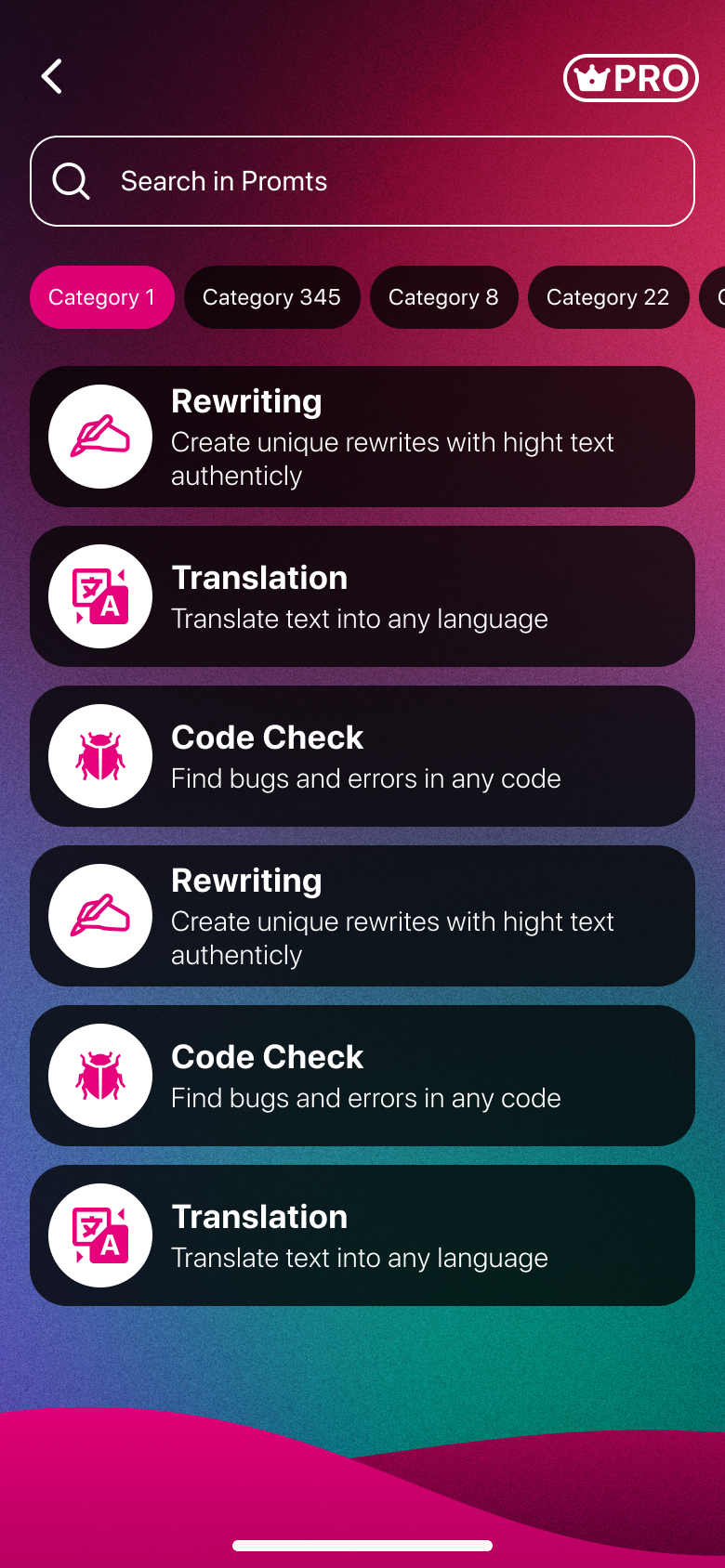
Assistants & prompt packs do the wording

What I designed
Specialised assistants (Tech Helper, Entertainment Advisor) and one-tap prompt packs (Rewrite, Translate) so people never have to know “prompt engineering” to get a great result.
The problem it solves
Good AI output requires good prompts — a skill most users simply don’t have, so their first results feel underwhelming and they give up.
The design bet
If the interface does the prompting for you, output quality stops depending on user skill — and the AI feels smart from the very first result.
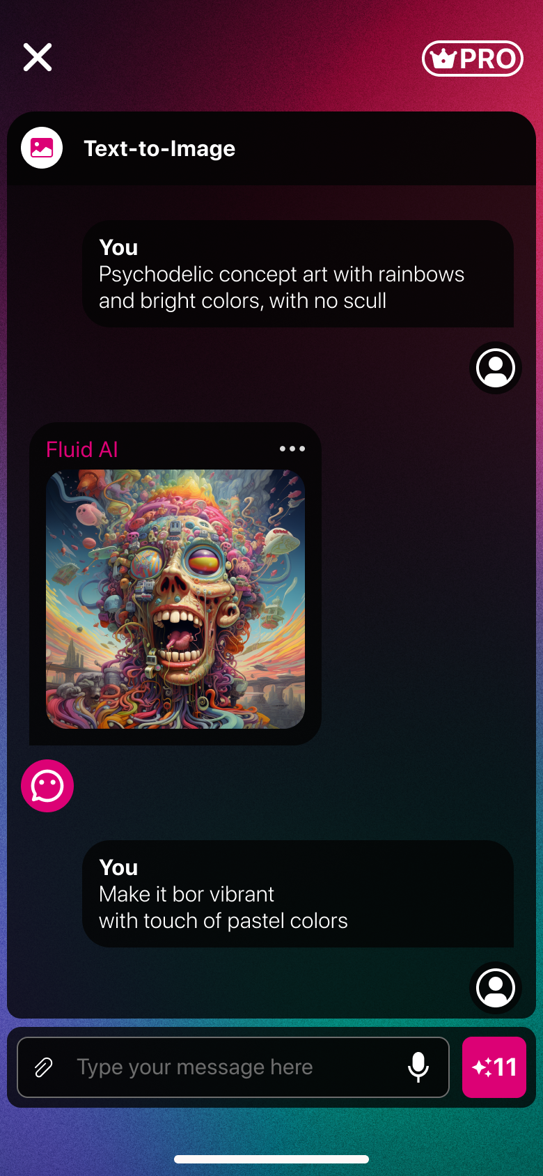
Chat with image gen
Paywall
03 Value before the ask

Let them feel it, then offer Pro

What I designed
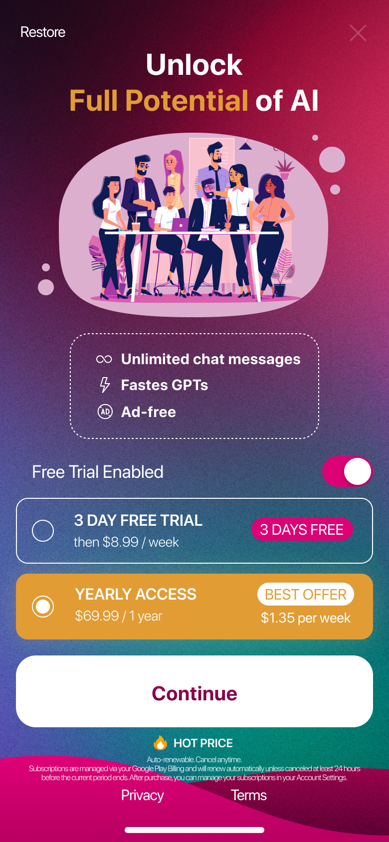
A credit system that lets new users create something real — even generate an image — before the paywall, which then frames Pro as “more of what you just loved,” not a gate.
The problem it solves
An upfront paywall lands as a tax when users haven’t felt the value yet — they haven’t seen what Pro even buys them.
The design bet
Letting users generate something real first reframes the Pro upgrade from a gate to "more of what you just loved" — a fundamentally different ask.

The hardest problem in AI design isn’t the model. It’s the empty input field.

What the concept demonstrates

Three bets, each with a testable rationale

🏠

Tool-first home solves the blank-box problem

Opening to vivid tool cards — not a cursor — gives every new user a ten-second starting point without requiring any prompt knowledge. The bet: discoverability drives first-session creation.

Pre-built intents democratise AI output quality

Specialised assistants and one-tap prompt packs remove the skill barrier. Users get high-quality results without ever writing a prompt — the bet is that this drives repeat use.

🔓

Value-first paywall reframes the monetisation moment

A credit system lets users generate something real before the Pro gate. The bet: "more of what you just loved" converts better than "pay to start."

What I'd validate next

📊

First-session creation rate

The primary signal: did the tool-first home actually get more new users to produce something vs. a blank-chat baseline? I'd run an A/B test on the home screen on day one.

🔄

Day-7 return rate by entry point

Which tool card drives the stickiest users? Knowing whether image gen or assistants builds the stronger habit would inform what to expand and what to promote.

💳

Credit → Pro conversion funnel

Does running out of credits at a high-value moment (first generated image) correlate with upgrade? I'd instrument each credit-spend event to find the exact trigger.

Reflection

What I’d do differently

🎛️

Tool-first can hide the open chat

A few power users wanted to just type. I’d keep the tools but make a plain conversation one tap away from anywhere.

🪙

Credits confused first-timers

“+11” wasn’t self-explanatory. I’d show what a credit buys at the moment it’s spent, not just a number.

🌈

The fluid gradients fought the content

Beautiful brand, but busy behind dense chat. I’d reserve the loud gradients for moments, not every surface.

Design system

Fluid, vivid, alive

Palette & gradient

Magenta
#E91E8C
Pink
#FF6EB4
Purple
#8B3DFF
Teal
#2EC5CE
Fluid
gradient

Typography — Inter display, DM Sans body, Space Mono accents

Display · 900
Fluid AI
Heading · 800
AI Tools
Body · 400
Psychedelic concept art with rainbows and bright colors.
Mono · meta
PRO · +11 credits

Key components

Text-to-Image

Tool Card

Vivid gradient entry points — the home of the app.

Make it vibrant with a touch of pastel colors

Chat Bubble

Clean dark bubbles over the fluid background.

Send · +11

Send / Credits

The gradient action, with credit context.