Self-initiated concept · iOS
Observer
I designed Observer from scratch — five everyday privacy guards in one calm app — making protection something people actually understand without becoming security experts.
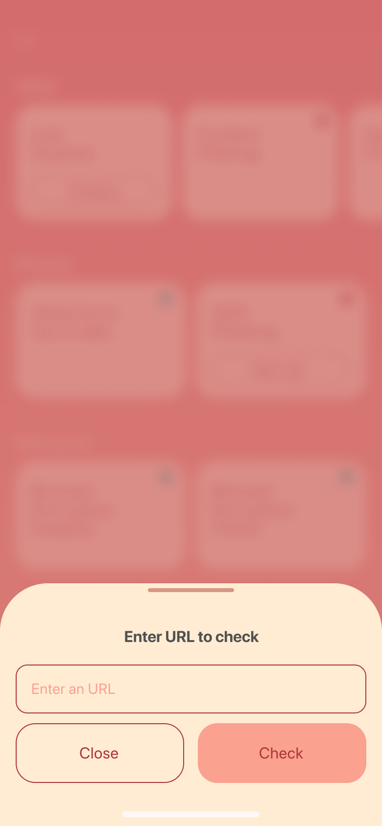
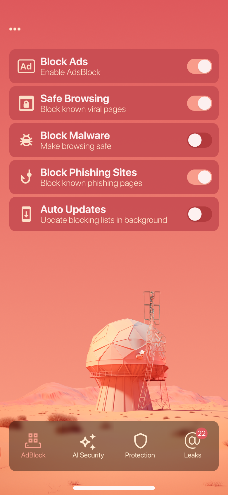
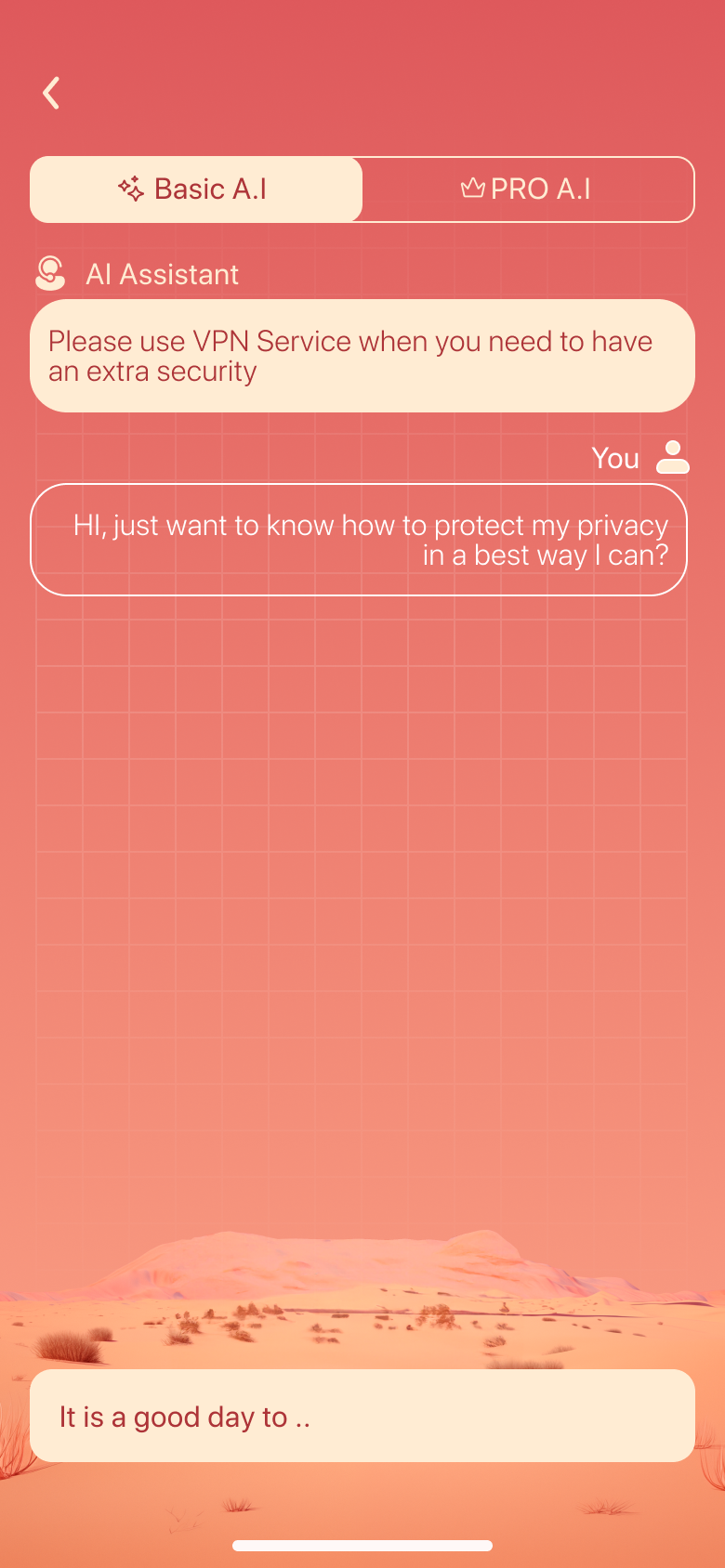
I designed Observer from scratch — five everyday privacy guards in one calm app — making protection something people actually understand without becoming security experts.
What this shows: Consolidating five complex privacy tools into one calm, understandable system — so everyday people feel protected without needing to become security experts.
Design bets
The challenge
Ads track you, links phish you, public Wi-Fi leaks you, and your email shows up in breach after breach. The “solutions” are a graveyard of single-purpose tools — each technical, each alarmist, none of them talking to each other. Regular people don’t want five security apps; they want to feel watched-over by one they trust.
My brief: fold ad-blocking, link safety, Wi-Fi checks, leak monitoring and an AI assistant into a single calm suite — powerful underneath, effortless on top.
The suite
Strip ads and trackers across browsing.
Score any URL before you tap it.
Know if the network you’re on is safe.
Watch your email for new breaches.
Ask anything; get plain-English answers.
A single check across every guard.
Discovery
I don’t know what I even need
Fragmented tools meant choice paralysis. People couldn’t tell which of five apps actually protected them.
Is this link safe to open?
The most common real-world worry — and no everyday tool answered it in a way a normal person could read.
Security apps scare me
Red alarms and jargon created anxiety, not confidence. People wanted calm reassurance, not a threat report.
From a teardown of how single-purpose privacy and ad-block apps present protection, and the confusion their public reviews surface — framed as the problem to design against.
Key decisions
I researched the space, mapped where people get lost or scared, and worked through each design decision with explicit trade-offs. These are the three that define the product.
Security software sells alarm. Observer sells the quiet feeling of being watched over.
What this concept shows
This is a concept grounded in competitive teardowns of public privacy apps and the patterns in their reviews. These are hypotheses — what I’d instrument and validate with a live product: guard activation, session length, and upgrade intent.
Reflection
Bundling helped, but I’d design a single “protection score” that rolls them into one number people can watch improve.
Users trusted it a little too much. I’d add visible boundaries on what it can and can’t verify.
Coral-on-coral looked beautiful but hurt contrast on dense screens. I’d push more neutral surface tones for data.
Design system
Palette
Typography — Plus Jakarta Sans
Key components
Every protection as one clear switch.
A single readable number, not a report.
Warm, friendly calls-to-action.