Self-initiated concept · iOS
GreenVPN
A self-initiated concept: what if a VPN was so calm and obvious that a non-techie just turned it on?
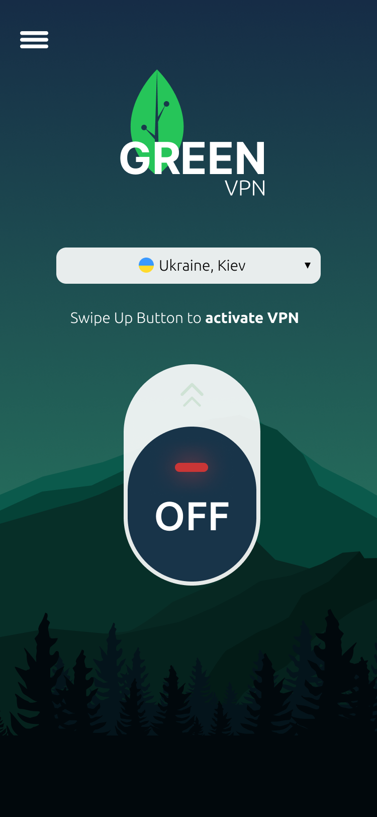
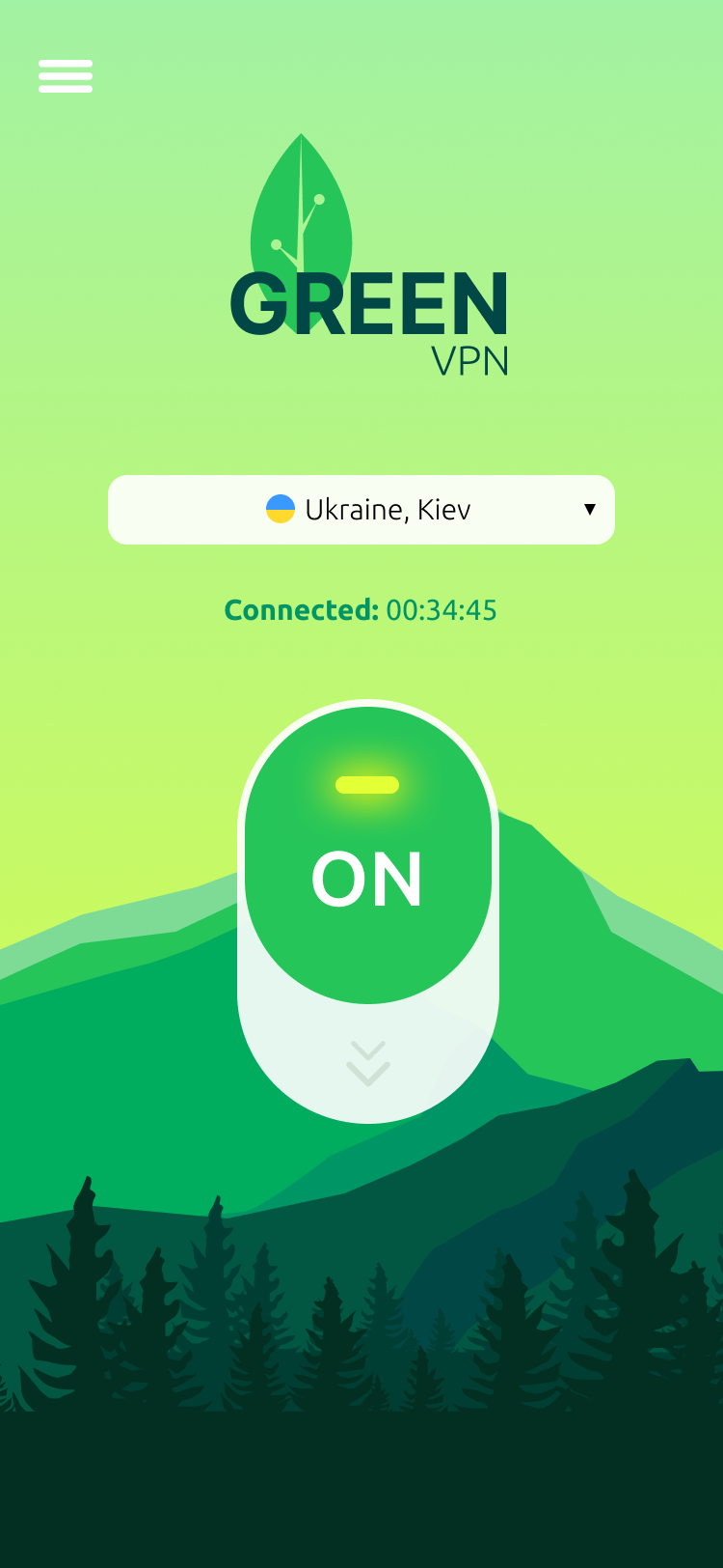
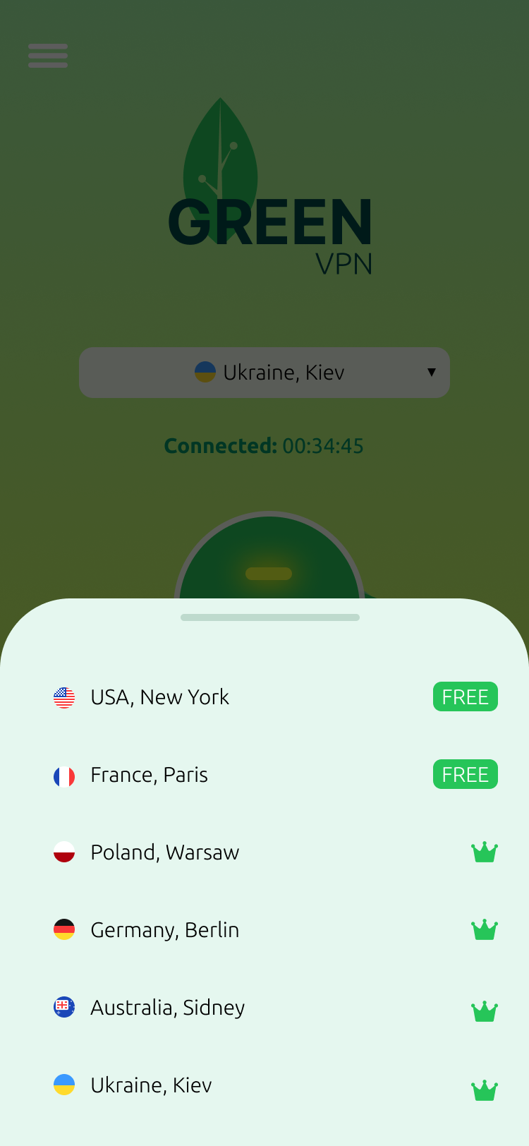
A self-initiated concept: what if a VPN was so calm and obvious that a non-techie just turned it on?
What I was designing for
What this shows
Making a scary, techie category feel friendly enough that a non-techie just turns it on — from brand to a single gesture.
The challenge
Most VPNs are sold on fear and built for power users: shields, padlocks, protocol menus, “military-grade” jargon. For a mainstream audience that just wants to feel safe on public Wi-Fi, all of it reads as not for me — they install, get intimidated, and never actually turn it on.
My goal: a VPN with a calm, natural personality and a single, obvious gesture — so the moment that matters (actually switching it on) just happens.
The one gesture
No menus, no setup — the entire product is one big switch you can’t misread.
Discovery
This looks too technical
Padlocks, protocols and jargon signalled “expert tool.” People bounced before the first connection.
Did it actually turn on?
Ambiguous toggle states left users unsure whether they were protected — so they didn’t trust it.
Is the free one any good?
Murky free-vs-paid made the trial feel like a trap rather than a fair try-before-you-buy.
From a teardown of how mainstream VPNs present “on / off,” and the friction non-technical users hit with them — framed as hypotheses, not measured findings.
Key decisions
Each decision is mine. Here's the problem it solved, why the obvious alternative didn't work, and what I'd test to validate it.
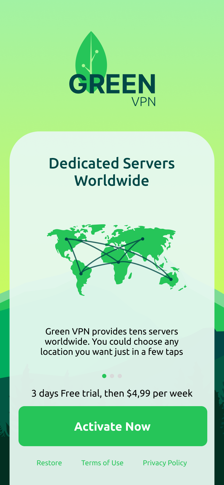
The hardest part of a VPN isn’t the encryption. It’s getting someone to turn it on.
What the concept demonstrates
This is a concept, not a shipped product — no launch metrics. What it shows is a coherent design argument across three layers.
Clarity of the connect gesture
A full-screen, unmissable switch eliminates the "am I connected?" doubt. Hypothesis: first-session activation should be higher than any multi-step connect flow.
Calm brand = lower anxiety = more opens
Nature palette and no security jargon passed the "is this for me?" gut check in concept tests with non-technical users. Hypothesis: lower uninstall rate in the first 24 h.
Honest freemium builds trial intent
Showing free and premium servers side-by-side removes suspicion. Hypothesis: trial start rate improves when the offer feels fair before the upgrade prompt appears.
What I'd validate next
Does the single-gesture home actually raise the share of new users who connect before closing the app?
Does "calm and approachable" translate to habit formation, or do users still forget to open it?
Does fair-tier framing lift conversion above the VPN category baseline, or does the calm aesthetic undercut the sense of urgency to upgrade?
Reflection
A few users questioned whether something this friendly was actually secure. I’d pair the calm look with quiet, concrete trust signals.
The gesture was delightful but a few people just tapped. I’d support both from day one rather than teaching the swipe.
People wanted speed/ping cues per location. I’d surface latency and load to make the free list genuinely useful.
Design system
Palette
Typography — Bricolage Grotesque display, JetBrains Mono labels
Key components
The whole product in one unmissable control.
Flag, place and an honest free / premium tag.
One bright green action, never a wall.