Back
SwipePhoto Observer Adblock Green VPN SoftShield VPN Fluid Chat AI Hypurr Wallet Yooca
Self-initiated concept · iOS

SoftShield

I designed SoftShield from scratch — research, UX, UI and a complete design system — around one core bet: make protection feel obvious, trustworthy and worth paying for.

Solo concept — research, UX, UI, design system iOS · 2024 Concept
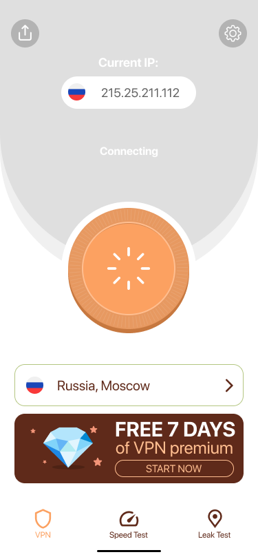
SoftShield connecting
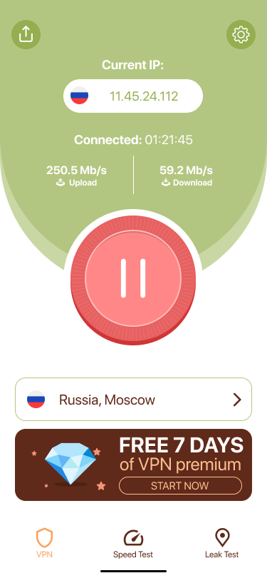
SoftShield connected
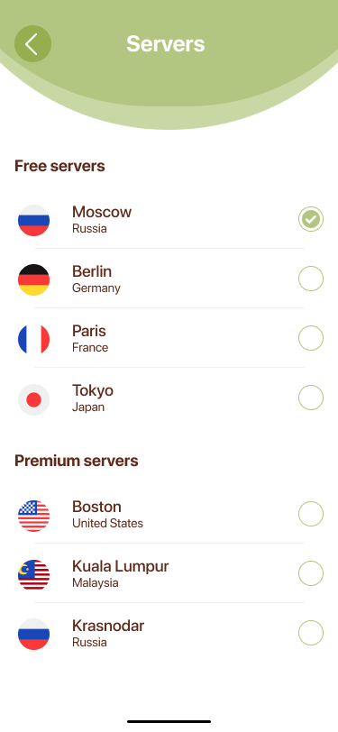
SoftShield servers
↗ What this shows

Design system + trust — a coherent component system, built from scratch, that makes a security product feel trustworthy enough to pay for.

My role
Solo designer — research, UX, UI, prototyping & design system
Scope
Full concept: discovery, flows, components, handoff
Timeline
2024 · Concept
Platform
iOS (iPhone) · subscription app

What I was designing for

One tap
to protect
No settings required — smart defaults that just work
Trust
before ask
Prove protection first — the paywall comes after the product earns it
Proof,
not promise
Built-in leak test and speed test let users verify protection themselves
Honest
monetization
Free and premium listed side by side — no bait-and-switch

The challenge

A VPN people didn't trust — or understand

SoftShield was a tiny VPN with a working product and a stalling business. Trials barely converted, week-one churn was brutal, and the top App Store complaint wasn't a bug — it was a feeling: "I have no idea if this thing is actually doing anything."

The category didn't help. Competitors buried users in servers, protocols and settings; the free-VPN space had trained people to expect shady upsells. My job wasn't to add features — it was to make protection feel obvious, trustworthy and worth paying for on a small iOS team.

Discovery

Three things kept showing up

Is it even working?

The #1 anxiety. With nothing to confirm protection, users assumed the worst and bounced. A trust gap, not a feature gap.

Too technical for me

Server lists, protocols and settings read as "not for normal people." Choice and jargon created hesitation at the worst moment.

I've been burned before

Years of sketchy free VPNs made any paywall feel like a trap. Trust had to be earned before we asked for money.

Grounded in a competitive teardown of mainstream VPN apps and the recurring language in their public App Store reviews — the trust gap I designed against.

How I decided

Three principles, every screen

1

Reassure, don't impress

Every screen answers "are you safe right now?" before anything else.

2

One tap, not ten settings

Defaults that just work. Power-user depth hidden until asked for.

3

Honest by default

No dark patterns. Free is free, premium is clear, exits are obvious.

Key decisions

Designed from scratch — the reasoning behind each call

Each decision below is grounded in research insights and the three principles the product is built on. I've included the trade-off I was navigating and where the design landed.
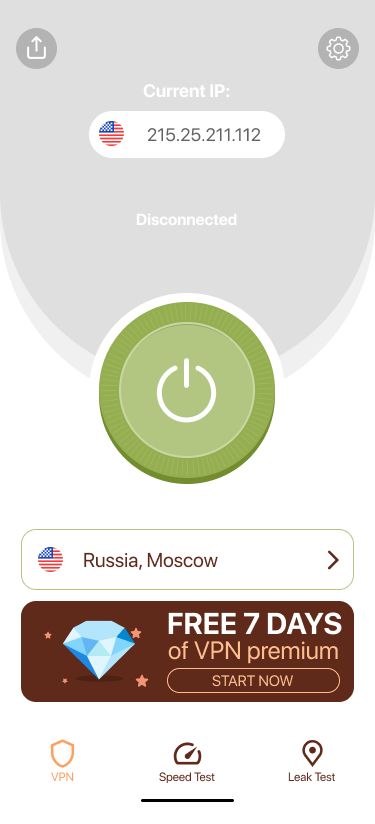
Connect — disconnected

Off

Connected

Live

01 The hero control

One button is the product

What I designed
I made the whole home screen one decision: a single oversized power button with unmistakable states — calm grey when off, warm coral when live — and IP, session timer and live throughput right under it.
The trade-off
A busier layout could surface more features at a glance. I chose to sacrifice discoverability for instant confidence — if users aren't sure whether they're protected, everything else is noise.
The bet
Strip the decision surface to one button. The screen the product lives or dies on should demand no thought.
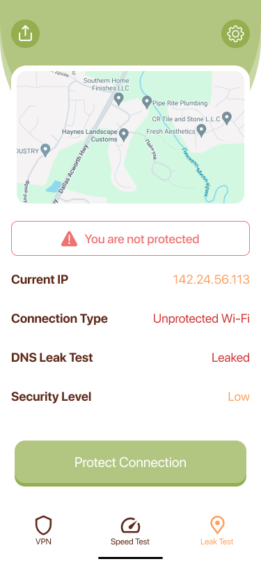
Leak test

Leak Test

02 Earning trust

A leak test that speaks human

What I designed
I designed a plain-language exposure report — current IP, connection type, DNS-leak status, security level — colour-coded, with a single "Protect connection" action. No logs, no jargon.
The trade-off
"Am I protected?" was the loudest, most expensive question in the research — it dominated support and tracked with churn. The alternative was to assume users would simply trust the status indicator.
The bet
Give users a tool to verify protection themselves. A plain-language exposure report turns anxiety into a one-tap fix — and trust earned here carries into the upgrade decision.
Servers

Servers

03 Honesty as strategy

A free / premium split with nothing hidden

What I designed
I built one honest list — free and premium locations together, real country flags, clear labels — no fake "fastest" nudges, no locked rows pretending to be free.
The trade-off
Research showed people braced for a bait-and-switch the moment they tapped a server. Conventional wisdom says hide the locks to drive curiosity. I bet the opposite: transparency reads as respect.
The bet
Users who understand what they're getting — and what they're not — are more likely to upgrade because they choose to, not because they were cornered.
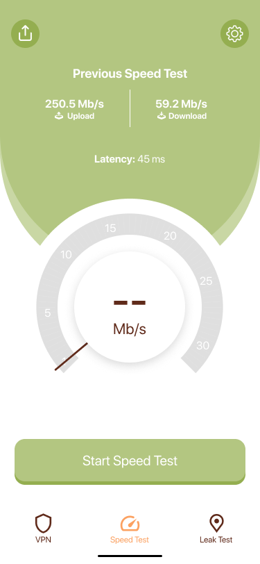
Speed test

Speed Test

04 Killing the objection

Prove the speed, in-product

What I designed
I added a built-in gauge speed test with a friendly dial and a saved "previous result," so people could see the cost of protection was small — on their own network.
The trade-off
"VPNs slow everything down" kept surfacing as the reason people never turned it on. The safe play was to leave users to test externally. I chose to own the answer in-product.
The bet
Handle the speed objection once, in context, before the paywall appears. Showing real numbers on the user's own network is more convincing than any marketing copy.
Onboarding

Onboarding

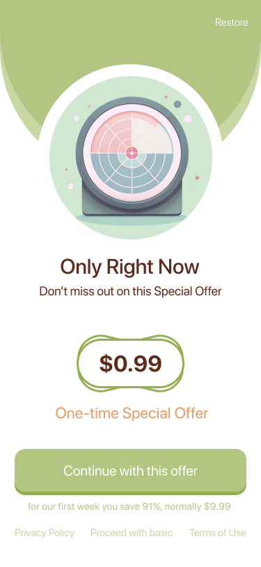
Paywall

Offer

Settings

Settings

05 Asking for money

One offer, not a pricing maze

What I designed
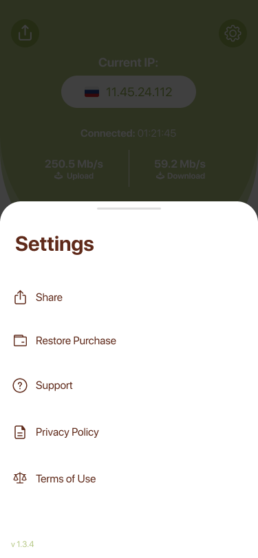
I replaced a multi-tier wall with a single, time-boxed offer — one clear price, an obvious restore, and an honest "proceed with basic" escape — reached only after the product had proven itself.
The trade-off
Research and concept testing showed that multi-tier paywalls create choice paralysis — and in a category already associated with scams, confusion reads as a red flag. More options felt like more to distrust.
The bet
Less choice, more trust. One honest offer — reached only after the product has proved itself — is the hypothesis the entire monetization flow is built on.

In a category that sells fear, SoftShield wins by selling calm — and proving it.

Concept outcomes

What this concept demonstrates

End-to-end product thinking

From a research-grounded problem frame — trust gap, not feature gap — through UX architecture, UI, a component library, and a monetization flow. One coherent system, not a collection of screens.

A design system built around a single thesis

Every token, component and pattern serves one idea: calm + proof = trust. The shield colour, the power-button states, the leak-test card and the paywall copy all reinforce the same bet — consistency is the brand.

Monetization designed to earn, not extract

One clear offer, an obvious restore, a visible free exit — reached only after the product has proved itself. The hypothesis: honest context converts better than pressure, especially in a category users already distrust.

What I'd validate next

Does the Leak Test measurably reduce "am I protected?" support volume?

Does the transparent server list improve upgrade intent versus a hidden-lock pattern?

Does the in-product speed test shift trial-to-paid behaviour at the paywall?

This is a self-initiated concept. No live metrics exist — decisions are grounded in competitive teardowns and public-review analysis, framed as hypotheses rather than post-launch measurement.

Reflection

Trade-offs I'd examine first in a real build

Split-tunnelling is out of scope — deliberately

It threatens the one-tap simplicity that is the whole bet. In a real product I'd ship it behind an "Advanced" shelf in v1.2, once the core had earned the right to add depth.

Intro pricing is a double-edged bet

Aggressive intro pricing lifts trials but may compress lifetime value. I'd want price-elasticity research before committing to the cheapest possible offer — the product now earns trust, so it may not need to compete on price alone.

App Store rating is a lagging proxy for trust

I'd instrument a short in-product trust survey to measure the feeling directly, rather than inferring it from reviews weeks later.

Design system

A calm, friendly visual language

Palette

Shield Green
#8FB94E · primary
Sage
#A7C47F · surfaces
Alert Coral
#E0594E · live / warning
Deep Brown
#5C3B26 · text

Typography — Nunito, rounded & warm

Display · 900
Connected
Heading · 800
Free servers
Body · 600
Tap the shield to protect your connection on any network.
Caption · 700
Current IP · Connection · Security

Key components

Connect Button

The hero control — reads on/off in an instant.

Russia, Moscow
Free server

Server Row

Flag, place and tier in a calm white card.

VPN
Speed
Leak

Tab Bar

Three jobs — protect, measure, verify.